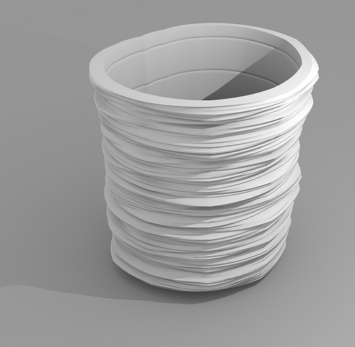
Processing the endless stream of weather data can be a little like drinking from a fire hose. So designer/artist Mitchell Whitelaw has found a new way to civilize information intake.

“Measuring Cup” is formed using 150 years of monthly average temperatures for Sydney, Australia. Says Whitelaw,
The structure of the form is pretty straightforward. Each horizontal layer of the form is a single year of data; these layers are stacked chronologically bottom to top – so 1859 is at the base, 2009 at the lip. The profile of each layer is basically a radial line graph of the monthly data for that year. Months are ordered clockwise around a full circle, and the data controls the radius of the form at each month. The result is a sort of squashed ovoid, with a flat spot where winter is (July, here in the South).
Whitelaw decided to smooth the data with a five-year moving average “because the raw year-to-year variations made the form angular and jittery.” The result is not only aesthetically pleasing but functional due to climate change:
The punchline really only works when you hold it in your hand. The cup has a lip – like any good cup, it expands slightly towards the rim. It fits nicely in the hand. But this lip is, of course, the product of the warming trend of recent decades. So there’s a moment of haptic tension there, between ergonomic (human centred) pleasure and the evidence of how our human-centredness is playing out for the planet as a whole.
In other words, don’t sip from your own data unless you can show a perceptible warming.
That’s an innovative way to display data, and the idea that you can hold it gives it a visceral feel in a way that standard “graphs” never can.