Today’s publication of State of the Climate in 2019 marks the 30th annual release in this series of supplements to the Bulletin of the American Meteorological Society. The report is not just a service for immediate use as the latest status report on climate. It’s a resource that people worldwide will use throughout the year, and indeed as a reference through the coming years. The report, now online only, is meant to stand a test of time as a bedrock of other reports and decisions.
 Despite the rapid pace of writing, editing, and reviewing, this is obviously not the first (or last) assessment of 2019’s climate. So we still often get asked—why now? Why release in August 2020 a comprehensive, validated check-up on the health of our planet’s climate in 2019 August, instead of in January, when it’s still hot news?
Co-editor Jessica Blunden of NOAA addressed the question a number of years ago, with a helpful look behind the scenes of State of the Climate. You can appreciate, first of all, the amazing job she and coeditor Deke Arndt (also of NOAA) do to pull this all together so fast—they’re coordinating the work of more than 500 authors and chapter editors from 61 different countries. So naturally, at first glance, churning out this report in only a matter of months is a managerial triumph–a testament to international cooperation:
The production of this document really does “take a village”; without the dedication and hard work of every single one of the people who contribute to this process, the quality and scope of the report would not be possible. Each year the number of authors tends to increase as we add new information to the report.
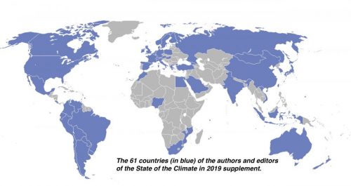 In just the past decade alone Blunden and Arndt have added 150 authors and 13 additional countries. Why so many authors?
The authors are asked to contribute based on their expertise in a specific field. For our Regional Climates chapter, which is comprised of annual summaries for countries around the world, the authors are often affiliated with a specific country’s official meteorological/hydrological agency and provide analysis based on data from that agency. it’s not just any process of coordination. State of the Climate is an elaborate scheme to make a scientifically worthwhile document:
The development of the report is quite rigorous, with writing, two major peer-review processes, technical editing, layout, and approval. After the calendar year has ended, authors are given about six weeks to develop their content and provide an initial draft that is reviewed by the chapter editors.
Then the chapter editor has the draft reviewed by two or three scientists with expert knowledge in that field. Generally, we allow one to two weeks for this review to be completed and another one to two weeks for the authors to make revisions, as needed, and for the chapter editors to prepare the new version for a formal, external review.
The external review process involves anonymous peer reviews, and BAMS allows three weeks for these reviews to be completed. The authors and chapter editors then have two weeks to make revisions based on these comments and submit the final draft for approval.
Then there’s editing and layout and so on . . . as Blunden summarizes:
This document takes the time to provide the most accurate information available on the state of the climate system.
But the time isn’t actually about writing and reviewing; it’s the comprehensiveness of 429 pages and a bazillion references (no, we didn’t count them). A report that started as a 30-pager gets bigger and more precise with each iteration, because the value increases:
The longer a data record is and the larger the area it covers, the more useful it is for putting a particular climate indicator into context, for example comparing one year to another, or detecting trends over time. Today we are fortunate to have technologies and capabilities that were not available to us decades ago, such as satellite observations, but to use all those observations for climate research means combining observations from multiple sources into a single, seamless climate data record, which is neither fast nor easy.
With both satellite and direct observations, it is important to reconcile data discrepancies and inaccuracies so that the climate records are correct, complete, and comparable, and this painstaking process can take years. For our report, a high-quality dataset is ready for inclusion only after its development processes and methodologies have been scrutinized through peer review with published results. That way readers of the State of the Climate reports can depend on detailed journal articles if they want to understand the details of a data record.
The process of creating a climate quality data set and then having it evaluated by other scientists through peer review is so challenging, no more than a few are added to the State of the Climate report each year.
So the State of Climate is a testament to a complex process, with complex, interrelated data sources that cry out for the reconciliation and comparison that makes the report unique. And of course, all about a climate that is nothing if not the paragon of complexity.
As Deke Arndt explains about Earth’s climate (in a webinar to watch before using State of the Climate): “If the Earth didn’t spin, and we didn’t have day and night, it would be very simple.”
That sums up the reason the State of the Climate is not simple . . . or small, or fast. It is all connected.


