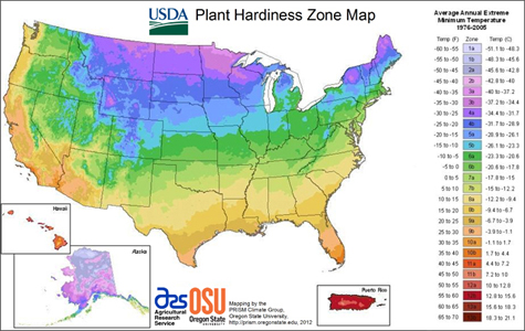
The United States Department of Agriculture recently released a map of U.S. planting zones to help gardeners across the country determine what they can and can’t grow. It’s the first new map since 1990, and the changes from the previous map reflect climate variability and change over the last 22 years.

The new map is based on average annual extreme minimum temperatures from 1976 to 2005, whereas the previous map used data from the years 1974-1986. Average temperatures throughout the U.S. were about two-thirds of a degree (F) higher in the more recent time span then they were from 1974 to 1986. As a result, the zones have shifted, and many locations around the country are now in warmer zones than they were on the previous map. Some states, such as Ohio, Texas, and Nebraska, have almost completely migrated to a warmer zone. Of the 34 cities highlighted in the 1990 map, 18 are in warmer zones in the updated version of the map. In general, much of the U.S. is about one-half zone warmer in the new map than in the 1990 edition.
The 2012 version of the planting zones map is the first that is GIS-based. Additionally, a new algorithm used for the 2012 edition enabled more accurate interpolation between weather reporting stations, and the new map also accounts for factors such as elevation changes and proximity to bodies of water, which led to more accurate mapping of the zones. Data used to create the map came from a total of 7,983 stations in the U.S., Canada, and Mexico, including stations of the National Weather Service, the Natural Resources Conservation Service, the Forest Service, the Bureau of Reclamation, the Bureau of Land Management, Environment Canada, and the Global Historical Climate Network.
An in-depth overview of the new map was published in February’s Journal of Applied Meteorology and Climatology. An interactive version of the map and more features can be found here.